This is the content of the pop-over!


Praxis Early Childhood: Mathematics and Science Practice Tests & Test Prep by Exam Edge - Free Test


Our free Praxis Early Childhood Assessment - Mathematics and Science (5028) Practice Test was created by experienced educators who designed them to align with the official Educational Testing Service content guidelines. They were built to accurately mirror the real exam's structure, coverage of topics, difficulty, and types of questions.

Upon completing your free practice test, it will be instantly reviewed to give you an idea of your score and potential performance on the actual test. Carefully study your feedback to each question to assess whether your responses were correct or incorrect. This is an effective way to highlight your strengths and weaknesses across different content areas, guiding you on where to concentrate your study efforts for improvement on future tests. Our detailed explanations will provide the information you need to enhance your understanding of the exam content and help you build your knowledge base leading you to better test results.

Login or Create an Account to take a free test

After you have completed your free test you will receive a special promo code that will save your between 10-15% on any additional practice tests!


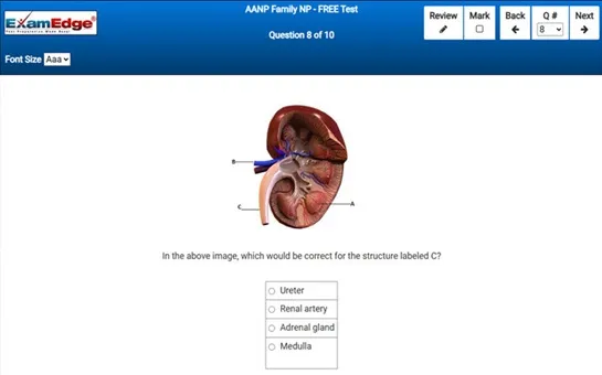
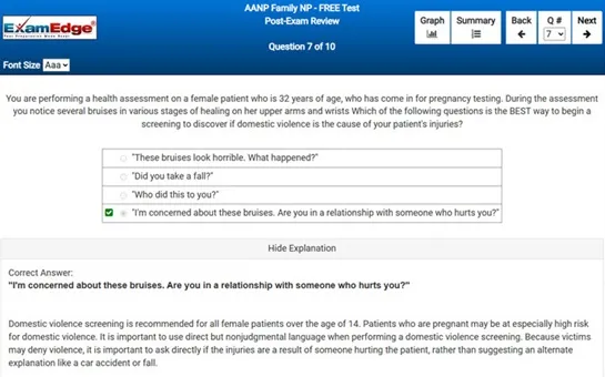
** Sample images, content may not apply to your exam **


Additional test information
Back To General Exam Info

Praxis Early Childhood Assessment - Mathematics and Science - Free Test Sample Questions

You are a math teacher who is explaining Bar Graphs to your math students.  Bar graphs use bars of different lengths to compare data.  The independent variable on a bar graph is grouped into categories such as months, flavors, or locations, and the dependent variable will be a ___________________.


Correct Answer:
quantity


bar graphs are a fundamental tool in data visualization, particularly useful for comparing information across different categories. each bar in a graph represents a category, which is the independent variable. common examples of categories include time periods (such as months or years), types of items (like flavors or products), or geographical locations. the height or length of each bar, on the other hand, represents a quantity, which is the dependent variable. this quantity could be anything that can be measured numerically, such as sales figures, population counts, percentages, or any other numerical data that varies from one category to another.

the reason why the dependent variable in a bar graph is always a quantity is that the essence of a bar graph is to show quantities that change according to different categories, enabling an easy visual comparison. by looking at the lengths of the bars, one can quickly discern which categories have higher or lower values for the dependent variable. this makes bar graphs an excellent choice for presenting survey results, business sales reports, demographic statistics, and much more.

furthermore, bar graphs can be extended to double bar graphs, which are used when comparing two sets of data across the same categories. this type of graph uses two bars for each category, each representing a different data set, thereby facilitating a direct comparison between them within the same context. for instance, a double bar graph could compare the sales of two different products across the same months of the year.

in conclusion, the dependent variable in bar graphs being a quantity is crucial because it conveys the measurable extent to which categories differ from one another. this quantitative representation aids in the effective communication of data insights and helps in making informed decisions based on the visual comparisons that bar graphs facilitate.